


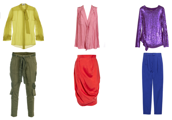
Today it was 65-degrees and overcast in New York, making the approach of fall a real reality. So what'd I do before heading to work? Threw on a pair of grey skinny trousers, black tank, and a black moleskin drape-front jacket. Several other coworkers showed up in mostly black or otherwise drab-colored outfits, too. What is it about colder temperatures that make New Yorkers immediately discard their color? I'm trying to get inspired by some of the fall runway colorful looks. Instead of pairing grey and black, why not pair sister tones of another hue? Like green... or pink.. or just change it up entirely with opposites.
Would this work in your office?
8 comments:
Good idea! I think this would work. I think everyone would be jealous that you are carrying the sunshine around with you!
I'm going to have to try this
i loveeeeee all of the colors, like so much!!
love,vdcouture
I don't work in an office, but I think if someone works in the kind of office that is very strict on dress code pairing muted tones of colour with greys, blacks, browns and blues could be the way to go. But I have to say I'm loving the looks you made :)
Oh love it ... makes me want to wear some color tomorrow :)
Most definitely! Love the utilitarian outfit. Such a fun way to look formal.
And those red trousers off the runway are incredible!
love the beautiful colors and these looks are fab! guess it depends on your work environment. sad to say for me, corporate offices i work in are on the dull side and not very fashion forward. maybe that's all the reason to brighten up the place! :)
http://style-haus.blogspot.com/
Def, yes, it will.
Love the purple maxi skirt!
LA
aahhhh I don't know if I can go with so much bright color! it's never been my thing for fall. I'm such a fan of neutrals and earth tones, it's terrible. and of course, black. I'm working in red and maybe some brighter blues, my new fave being "robins egg" blue. =) ... kinda like the avocado-y ish green, though too!
Post a Comment